About Me


LUNCHIE / PROJECT
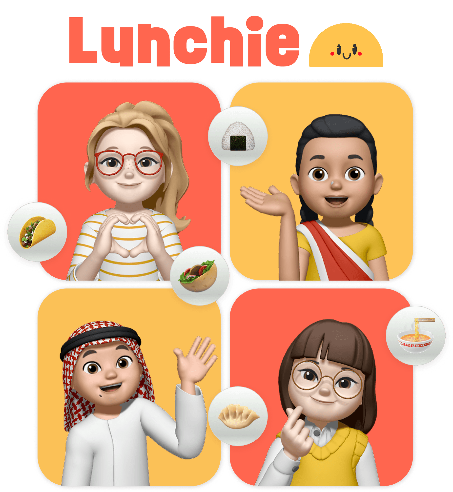
Fostering Cultural Awareness in Children Through Shared Meals
UX/UI Design
Concept
Designing a school-based meal exchange that introduces cultural diversity through everyday lunches.
Lunchie is a speculative mobile app concept that helps parents diversify their children's diets through a community-based meal exchange program.
While the product itself is conceptual, the design process explored how such a system could work within real school environments.
Project type:
Speculative Concept, Academic Project
Duration:
Nov - Dec 2022
Team:
Research:
Suchita Pallavi
Sanket Bhatnagar
UI/UX Design:
Aira Purificacion
Mark Magnaye
CONTEXT
Why food exposure matters in childhood
Children's early experiences with food can influence how they perceive different cultures.
Research suggests that when children are exposed to a variety of cuisines, they are more likely to develop curiosity and empathy toward people from different cultural backgrounds.
Conversely, children who grow up eating a limited variety of food may have fewer opportunities to experience and understand cultural differences.
This insight led us to explore a simple question:
↓ ↓ ↓
Could school lunches
become a gateway to
cultural discovery?
DEFINING THE PROBLEM
Limited food exposure can shape cultural perception
Many children grow up eating the same types of meals every day. While this often happens unintentionally, it can limit their exposure to new foods and cultural traditions.
Without opportunities to experience unfamiliar cuisines, cultural differences may remain distant or misunderstood.
If children could regularly encounter new foods in everyday settings, it might help foster curiosity, openness, and cultural understanding at an early age.
THE OPPORTUNITY
Turning lunchtime into a cultural experience
School lunch is one of the few daily moments where children gather around food together. This creates an opportunity to introduce cultural diversity in a way that feels natural and engaging.
Instead of treating cultural education as a separate subject, we explored how it could become part of everyday routines.
Our product vision
We envisioned a mobile app where parents could upload home-cooked meals and match them with other families in the same class.
Inspired by the simplicity of matching apps, parents can browse available meals and select exchanges for their child.
Teachers then coordinate the handover of meals during school hours.
It's a multi-stakeholder experience..
Lunchie connects three different groups who all contribute to the experience:
Parents: Prepare and upload meals, contributing dishes that children can exchange within the class.
Teachers: Facilitate the exchange in the classroom and manage meal distribution.
Schools: Support the program and integrate the experience into daily school routines.
Designing the system required balancing the needs of all three groups while keeping the process simple and manageable.
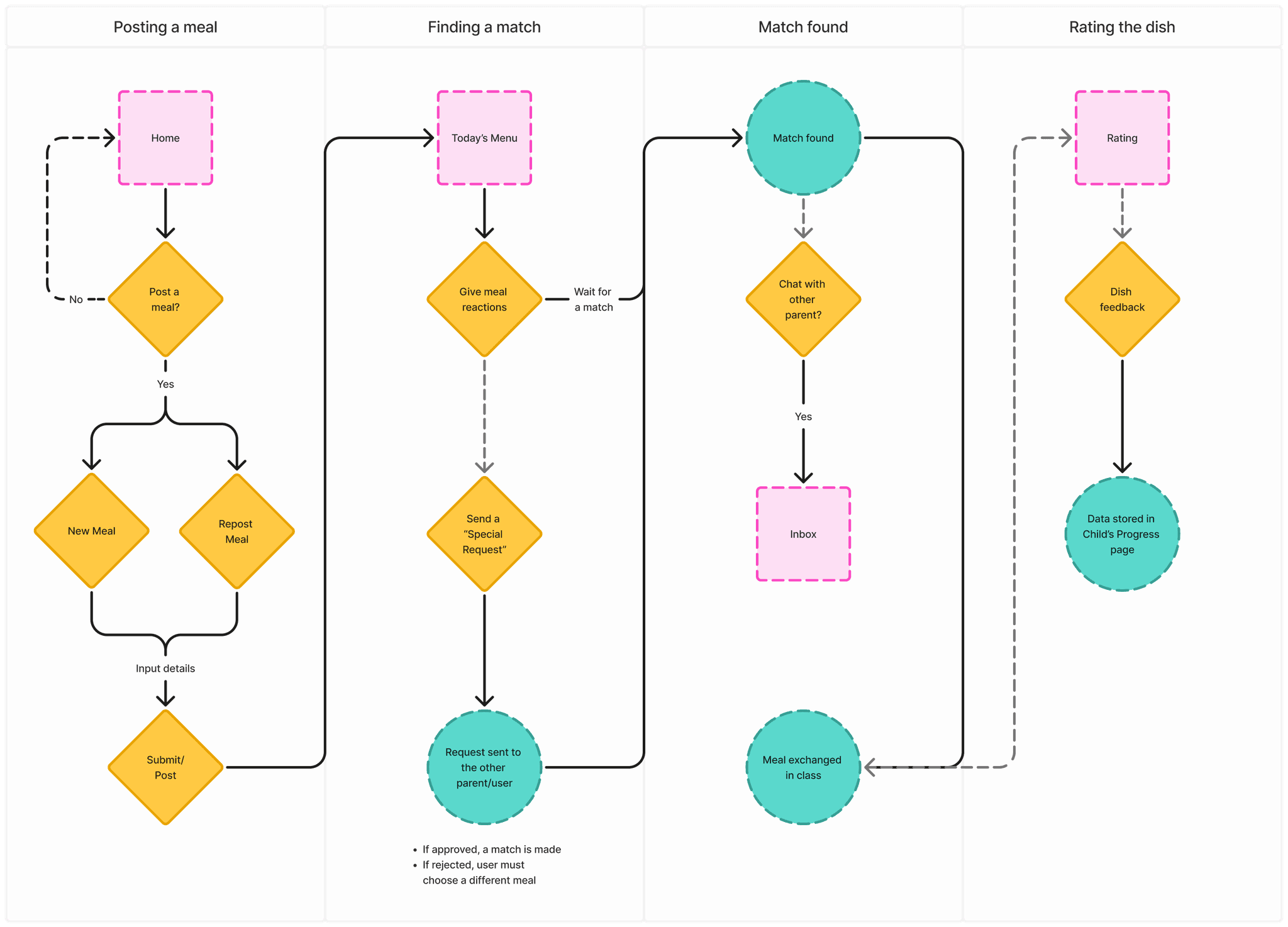
The meal exchange flow
How the system works:
Parents upload a meal
Parents browse available dishes
Parent selects a meal exchange
System confirms the match
Teacher distributes meals in class
Child experiences a new cuisine
Parents submits a meal rating
System updates child preference data
DESIGN PROCESS
From sketches to iterative feedback
We began by sketching ideas during brainstorming sessions.
These sketches were translated into wireframes that explored the structure and interactions of the app.
Each round of wireframes was presented during class critiques. Feedback from peers and our professor helped identify usability issues and refine the concept.
Through multiple iterations, the experience gradually evolved into a more practical and user-friendly design.
DESIGN DECISIONS
Key iterations that improved the experience
Prioritizing information over visual appeal
When beautiful food images were not enough.
INITIAL APPROACH
In the early concept, the home screen focused entirely on “Today’s Menu.”
This decision came from two influences:
The experience was inspired by dating apps, where visual matching drives interaction.
Our research suggested that food is highly visual. People are often drawn to meals based on appearance, reflecting the idea that “we eat with our eyes first.”
Because of this, the interface emphasized large food images to encourage participation in the exchange.

↙
INITIAL DESIGN
WHAT WE LEARNED
However, once we mapped the full user journey, a problem became clear. After parents joined the meal exchange, they needed practical information rather than visual browsing.
Parents wanted to quickly understand:
the status of the exchange
what step they were currently in
what action they needed to take next
↙
INITIAL DESIGN
DESIGN DECISION
We redesigned the home screen to function as a dashboard for the meal exchange process.
The updated layout prioritizes:
exchange status and progress
upcoming exchange details
clear next steps for parents
“Today’s Menu” remains visible to maintain excitement around the meals, but it now plays a supporting role rather than dominating the interface.
Simplifying Navigation
Removing actions that no longer served a purpose.
INITIAL APPROACH
To encourage parents to participate in the meal exchange, we placed an “Add Meal” button directly in the navigation bar.
The idea was to make meal submission highly visible and easy to access. By placing the action in the primary navigation, parents could quickly add a meal whenever they opened the app.
↓
INITIAL DESIGN
WHAT WE LEARNED
However, once the exchange process began, this button quickly became redundant. At that stage, parents had already submitted their meals, and the primary task shifted from adding meals to tracking the exchange process.
Keeping the button in the main navigation introduced unnecessary visual noise and suggested an action that was no longer relevant.

FINAL DESIGN
DESIGN DECISION
To simplify the experience, we removed the “Add Meal” button from the navigation bar.
Instead, the option was integrated into the Exchange screen, where it appears as part of the exchange workflow.
This change ensured that:
navigation remained clean and focused
actions appeared only when they were relevant
the interface better reflected the user’s stage in the exchange process
By aligning actions with the user journey, the interface became clearer and easier to navigate.
Designing for positive interactions
Encouraging appreciation instead of rejection.
INITIAL APPROACH
In the original design, users could express their preferences for dishes using three reactions: “like,” “super like,” or “dislike.”
This interaction was inspired by matching systems commonly used in social apps. The goal was to allow parents to quickly indicate which meals their child might enjoy.
↘
INITIAL DESIGN
WHAT WE LEARNED
However, as we reviewed the experience in the context of a school community, we realized that the “dislike” option could create unintended social consequences.
Negative reactions to meals could make some parents feel uncomfortable or discouraged from participating. Since the dishes were prepared by other families, publicly rejecting a meal might introduce unnecessary tension within the classroom community.
In a system designed to promote cultural exploration, highlighting dislikes risked undermining the collaborative and supportive environment we wanted to encourage.

FINAL DESIGN
DESIGN DECISION
To keep the experience positive and inclusive, we removed the “dislike” option.
Users can now express their preferences by liking or super liking dishes, focusing on meals their children are excited to try.
This change shifts the interaction from rejecting dishes to celebrating favorites, reinforcing the idea that the exchange is about discovering and appreciating new cuisines rather than filtering them out.
CORE EXPERIENCE
Turning the concept into a usable product
Lunchie was designed to support the full lifecycle of a meal exchange, from posting a meal to tracking a child’s food journey over time.
The experience focuses on making participation simple for parents while giving teachers the tools needed to coordinate exchanges in the classroom.
#1 Joining the exchange
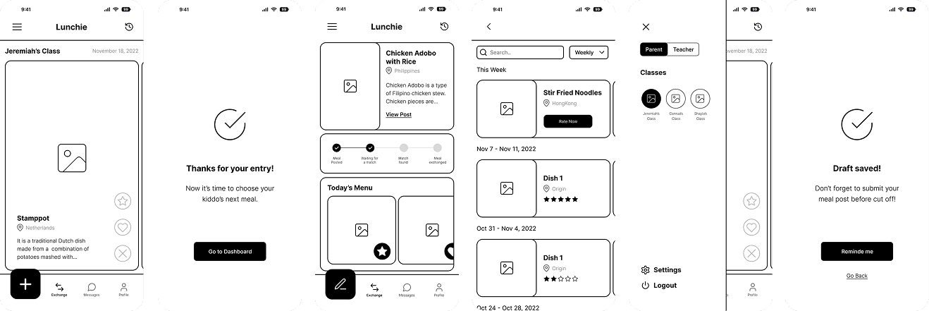
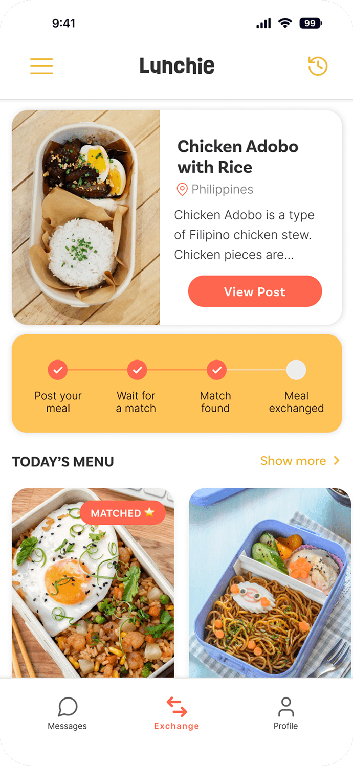
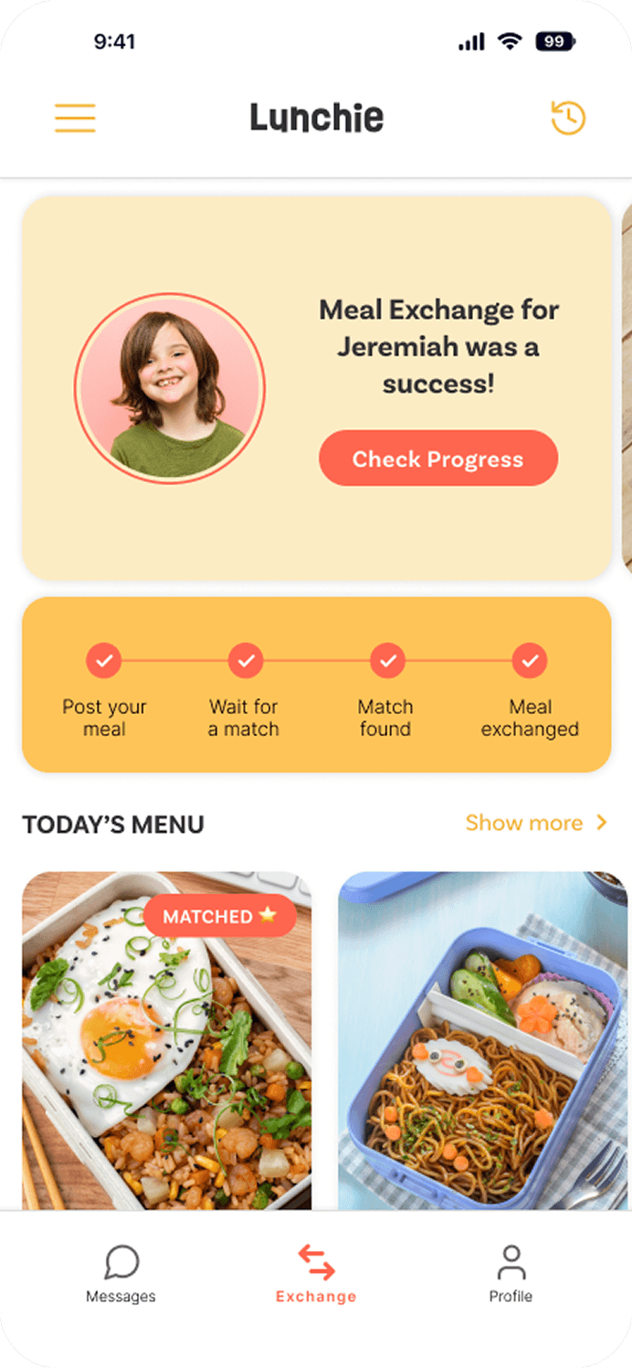
Home Screen
The home screen acts as the central hub for parents participating in the exchange.
Rather than focusing only on food discovery, the interface highlights where users are in the exchange process and what actions they should take next.
It includes:
a call-to-action encouraging participation
a progress indicator showing the current stage of the exchange
Today’s Menu, which maintains excitement around the meals being shared
This layout helps parents quickly understand the status of the exchange while still allowing them to explore upcoming dishes.

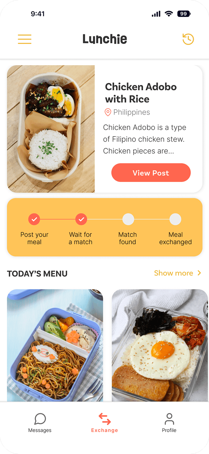
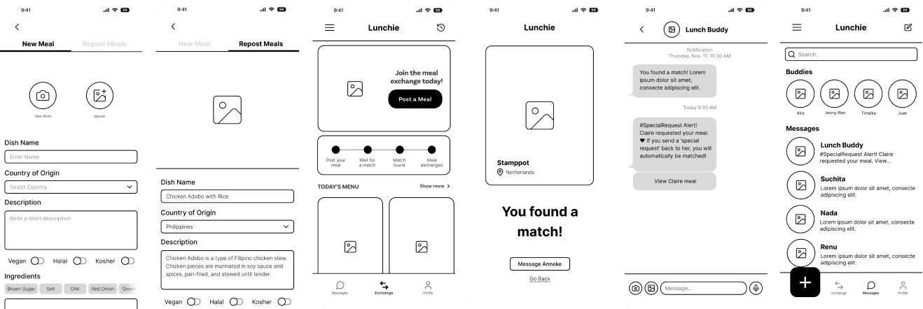
Posting a meal
To encourage consistent participation, the meal submission process was designed with busy parents in mind.
Two features help simplify the process:
SAVE DRAFT
Parents can start preparing a meal entry in advance and finish it later, allowing them to plan ahead without rushing.
REPOST MEAL
Previously shared meals can be reposted quickly, removing the need to re-enter the same information multiple times.
These features reduce friction and make it easier for families to contribute meals regularly.

FLOW: MEAL POSTING
#2 Choosing and coordinating meals

FLOW:
MEAL BROWSING
Choosing a meal
Parents browse meals shared by other families in the class and select dishes their child may receive during the exchange.
To support this decision-making process, the app provides two simple signals:
LIKE ❤️
Parents can show interest in a meal by liking it. This signals that they would be happy for their child to receive that dish and increases the likelihood of being matched with it during the exchange.
SPECIAL REQUEST ⭐
If a parent strongly prefers a specific dish, they can send a Special Request. This indicates a stronger preference and notifies the parent who shared the meal, opening a conversation thread to coordinate the exchange.
These signals help the system understand which dishes families are most interested in while still allowing room for discovery.
Lunchie Recommended
The system highlights certain meals with a Lunchie Recommended stamp. These recommendations are based on the child’s past ratings and their exposure to different cuisines.
By surfacing these suggestions, the app helps parents gradually introduce new foods while still considering what their child is likely to enjoy.


FLOW: INBOX
Connections
Because meal exchanges involve coordination between families, the app includes a lightweight messaging feature that activates when a Special Request is sent.
When a parent marks a dish with a ⭐ Special Request, the parent who posted the meal receives a notification. This notification appears as a chat message, opening a conversation thread between both parents.
Through this chat, parents can:
confirm the exchange
ask questions about the meal
coordinate details if needed
By linking communication directly to the matching interaction, the app keeps conversations focused on the exchange while making coordination between families easier.
This feature also helps build a sense of trust and community among parents participating in the program.
#3 Reflecting on the exchange

FLOW: AFTER THE EXCHANGE
Food Rating
At the end of the day, parents receive a notification prompting them to rate the meal their child received.
These ratings are not shared with other parents. Instead, they are used to improve the system’s understanding of the child’s preferences.
Over time, this data helps the platform recommend meals that both expand the child’s food exposure and match their tastes.
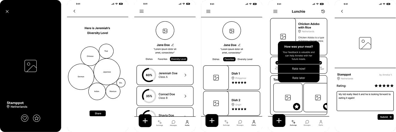
User Profile
The User Profile acts as the parent’s personal hub for managing their participation in the meal exchange.
Here, parents can:
review meals they have previously shared
revisit favorite dishes saved through ratings
access their child’s exchange history
If a parent has more than one child or participates in multiple classes, each class maintains its own menu, records, and exchange history. This helps keep participation organized across different school groups.
By bringing these details into one place, the profile makes it easier for parents to stay oriented and revisit past exchanges.

FLOW: USER PROFILE
#4 Tracking long-term growth
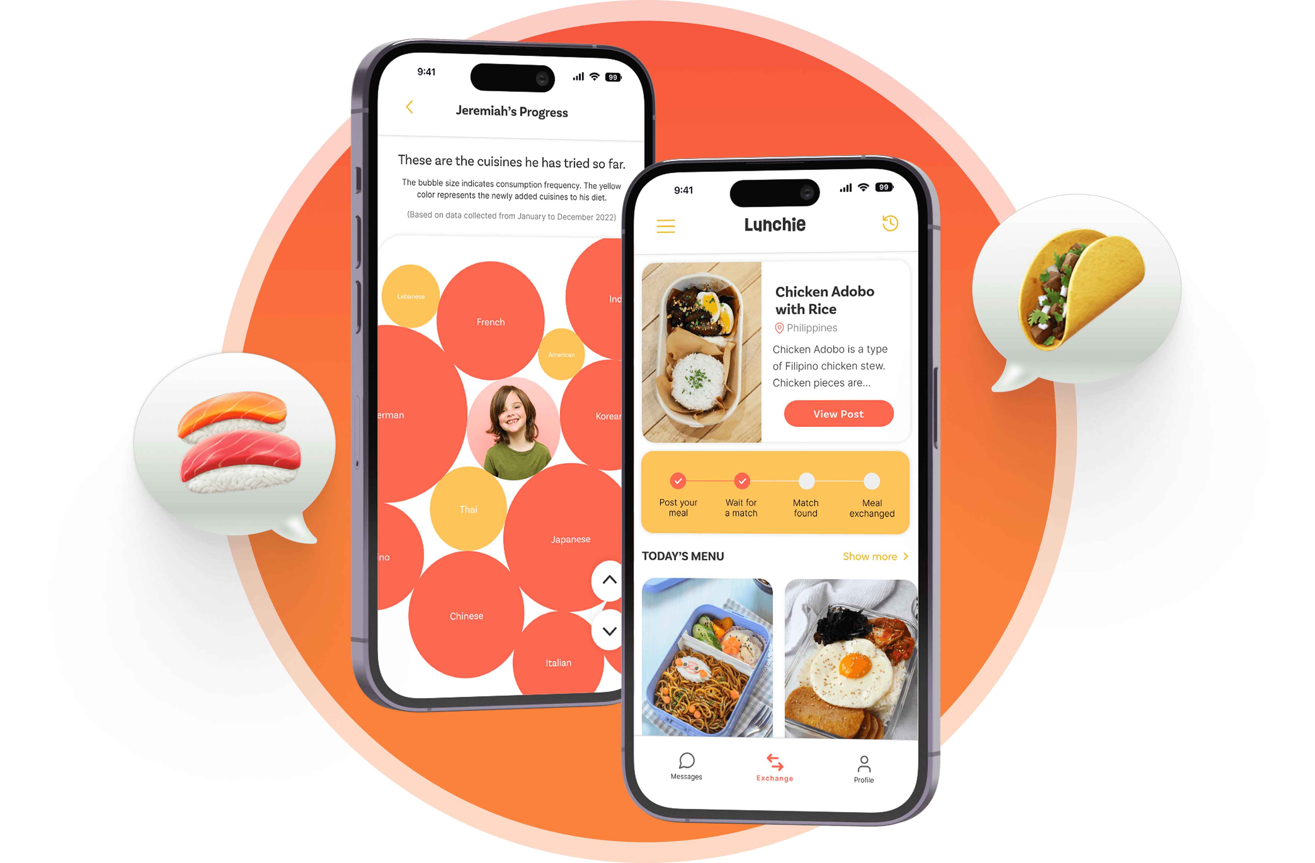
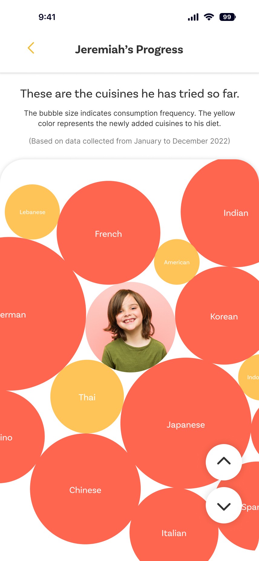
Child Progress
One of Lunchie’s long-term goals is to help children gradually expand their food horizons.
The Child Progress section visualizes this journey through a cuisine diversity chart. Each bubble represents a cuisine the child has experienced, while the size of the bubble reflects how often that cuisine appears in their meals.
New cuisines are highlighted, making it easier for parents to see how their child’s exposure to different foods and cultures is growing over time.
This feature shifts the experience from a simple meal exchange into a longer-term journey of discovery, helping parents track how everyday lunch choices can contribute to broader cultural awareness.
FLOW: CHILD PROGRESS
data visualization
#5 Supporting the classroom worflow
Teacher Mode
Since meal exchanges happen in the classroom, teachers play an important operational role.
Teacher Mode provides a simplified interface where educators can:
track which meals are being exchanged
confirm completed swaps
review exchange records for each class
This ensures the program remains organized and manageable during school hours.

FLOW: TEACHER MODE
VALIDATION & NEXT STEPS
Preparing the concept for real-world use
Future testing could explore:
parent onboarding clarity
teacher workflows for managing exchanges
children's willingness to try unfamiliar foods
WHAT I WOULD IMPROVE NEXT
On the top of my head..
One important area for improvement is accommodating dietary restrictions and food safety considerations.
In real school environments, children often follow specific dietary requirements due to cultural, religious, or health reasons. Future iterations of the product would introduce filters and safeguards for:
vegetarian and vegan diets
halal or kosher meals
common allergens such as nuts, dairy, or gluten
Parents could specify these preferences during onboarding so the system can recommend meals that are both safe and culturally diverse.
During discussions with industry designers, this aspect was highlighted as a key requirement for real-world implementation.
WHAT I LEARNED
Designing systems that connect multiple stakeholders
Lunchie highlighted how everyday experiences can influence cultural understanding.
Designing the system required balancing the needs of parents, teachers, and schools while keeping the process simple.
The project reinforced how thoughtful design can introduce cultural awareness through small but meaningful interactions.