COINPUSHER / BETTERLORE
Designing a Scalable
Real-Time Feedback System
UX/UI Design
Interaction Design
Translating platform events into clear user feedback.
Interactive platforms constantly generate events: rewards, alerts, or state changes. For users to understand what is happening, these events must be translated into clear and meaningful feedback.
In Coin Pusher, player actions continuously trigger reward events based on physics calculations and win thresholds. However, the original interface treated most outcomes almost identically, making it difficult for players to distinguish between routine rewards and high-value wins.
This project focused on designing a scalable feedback system that translates platform events into differentiated user states. By defining clear feedback tiers, motion logic, and supporting audio cues, the system ensures players can instantly interpret the significance of an outcome while maintaining smooth real-time performance.
Project type:
New Feature
Duration:
~4 months (alongside other projects)
Role:
UI/UX Design, Interaction Design, Illustration, Motion Design, State Logic Definition
Tools:
Figma, Rive, Adobe Illustrator, Adobe Photoshop
Platform:
Mobile & Desktop (Portrait & Landscape)
Note: Some visuals and animations have been modified or recreated to respect confidentiality. The design decisions and process reflect the original work.
CONTEXT
Why this mattered
Before this work, win feedback lacked hierarchy. Small wins and high-value jackpots were visually similar, which flattened emotional payoff and reduced clarity for players.
From a system perspective, the platform was generating events with different magnitudes, but the interface was not effectively translating those differences into meaningful feedback.
Old win feedback system (before redesign)
Over time, this introduced a broader risk: if high-value moments don’t feel meaningfully different, players may miss the emotional peaks that drive engagement. Low impact during major rewards can affect session length, replay behavior, and overall perceived game quality.
At the same time, previous animation approaches relied heavily on PNG assets, which created performance issues across devices. Any new system needed to balance emotional impact, technical constraints, and development efficiency.
How might we design a scalable feedback system that translates platform events into clear, differentiated user states while maintaining real-time performance?
OUR GOALS
What success looked like
The objective was not simply to add visual celebration, but to design a structured feedback system that could scale with platform events.
The system needed to:
Ultimately, the goal was to create a reusable feedback architecture that could support future reward mechanics and platform features.
IDEATION & EXPLORATION
Designing the feedback architecture
Defining the feedback tiers
The first step was determining how many distinct feedback states the system should support.
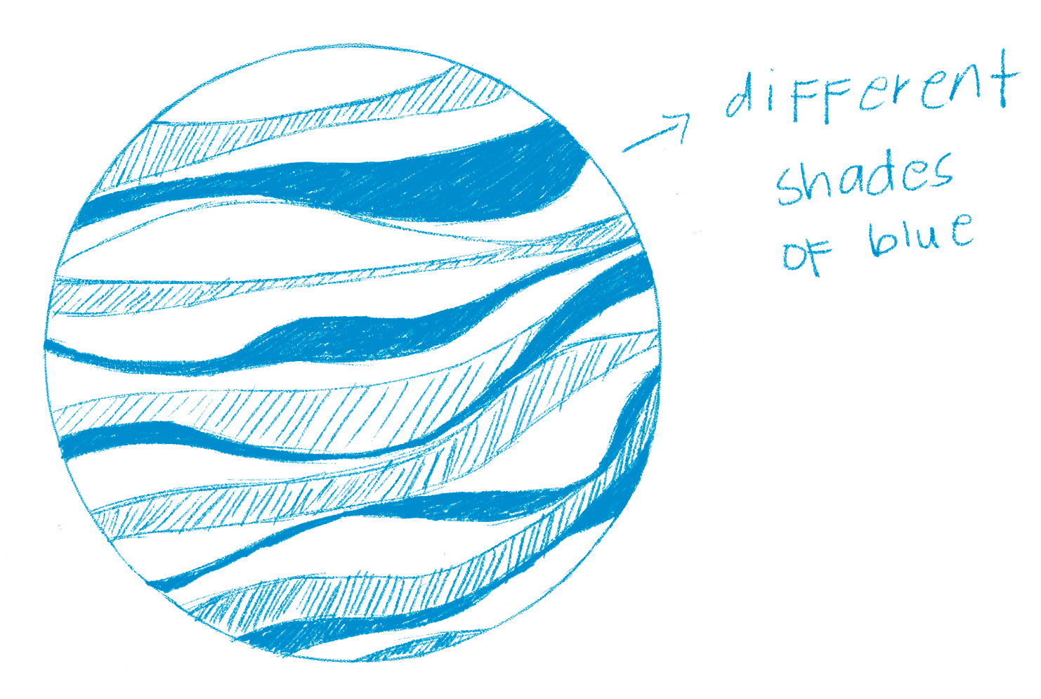
We initially explored a nine-tier structure, inspired by celestial bodies. Each tier was represented by a planet, with the size of the planet reflecting the magnitude of the win. Smaller planets represented low-value rewards, while the Sun symbolized the largest jackpot event.
At the time of presenting this concept, I had already created three illustrations. During review with leadership, two challenges became clear.
1
The structure introduced unnecessary production complexity
2
Several tiers were visually too similar to clearly differentiate
The framework was therefore refined into five tiers: XS, S, M, L, and XL.
My role was to adapt the visual system so that each tier remained distinct in scale, pacing, and visual intensity, ensuring the hierarchy remained clear while keeping the system feasible to implement.
Refining the state language
Another challenge involved the text embedded in the animations.
Because the animations were built in Rive, the text could not be dynamically localized (at that time! ☺). Longer phrases would therefore introduce translation issues when the platform expanded internationally.
To address this, we replaced longer titles with short universal expressions. These terms are concise, expressive, and easily understood across languages.
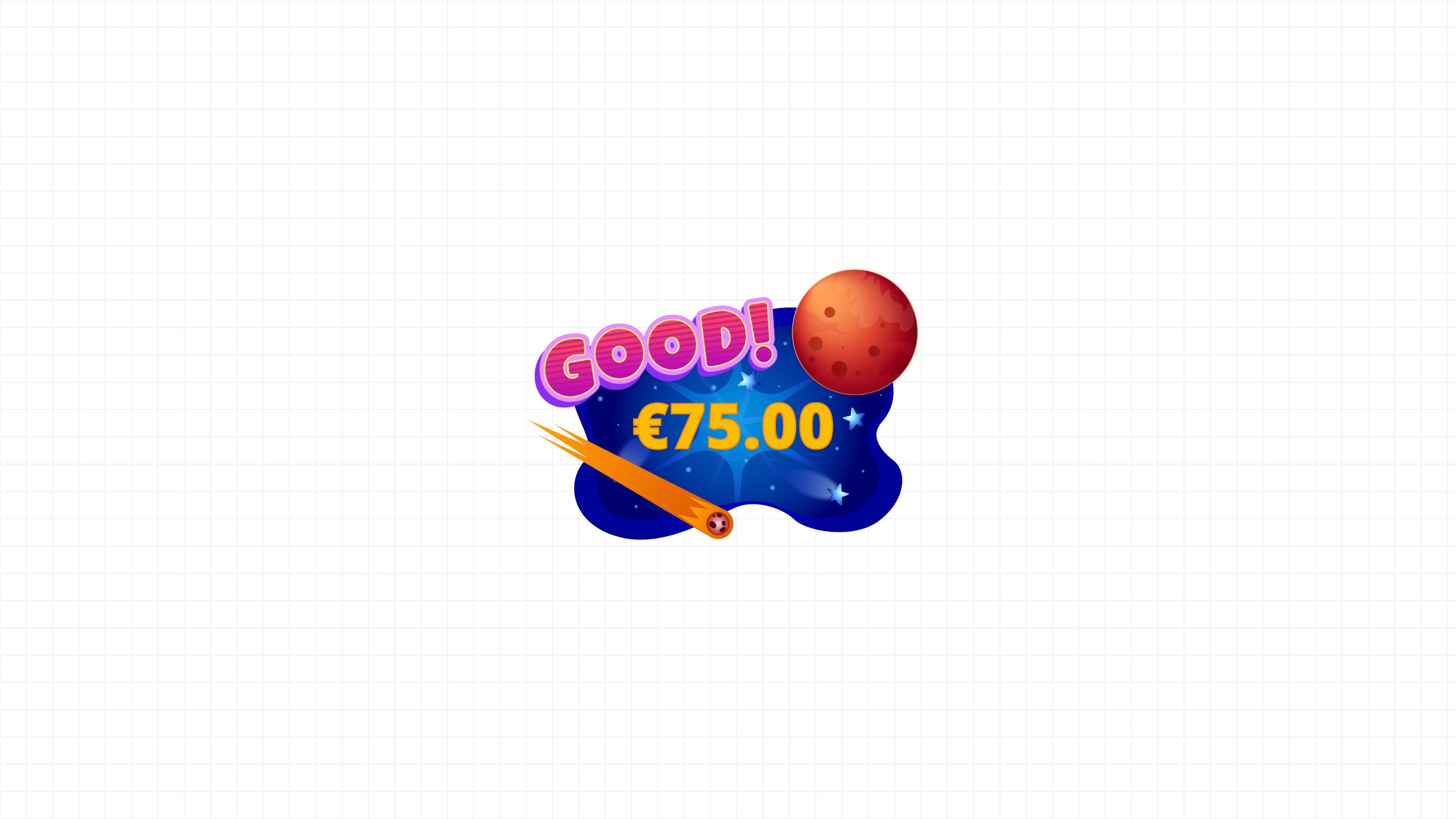
extra small win → "Good!"
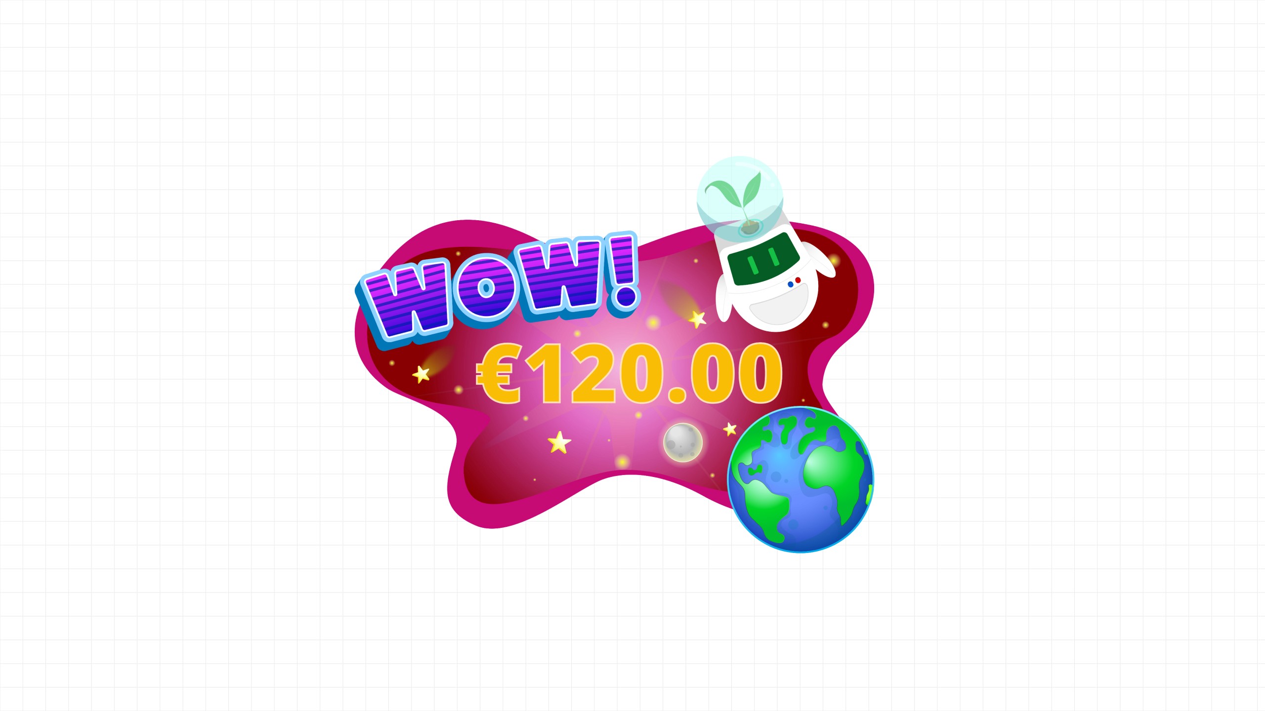
small win → "Wow!"
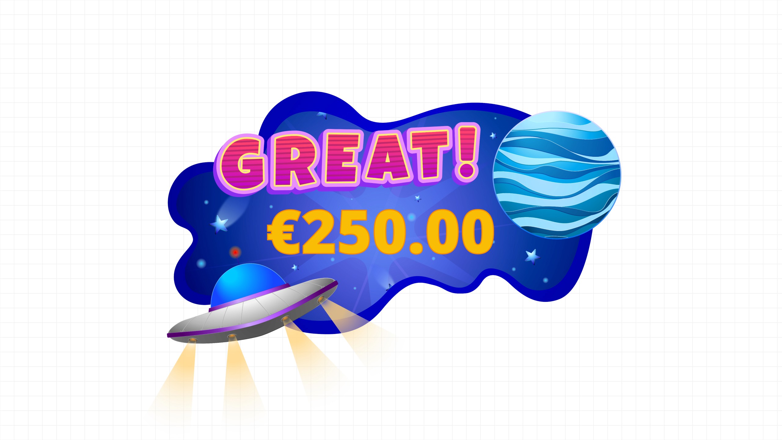
medium win → "Great!"
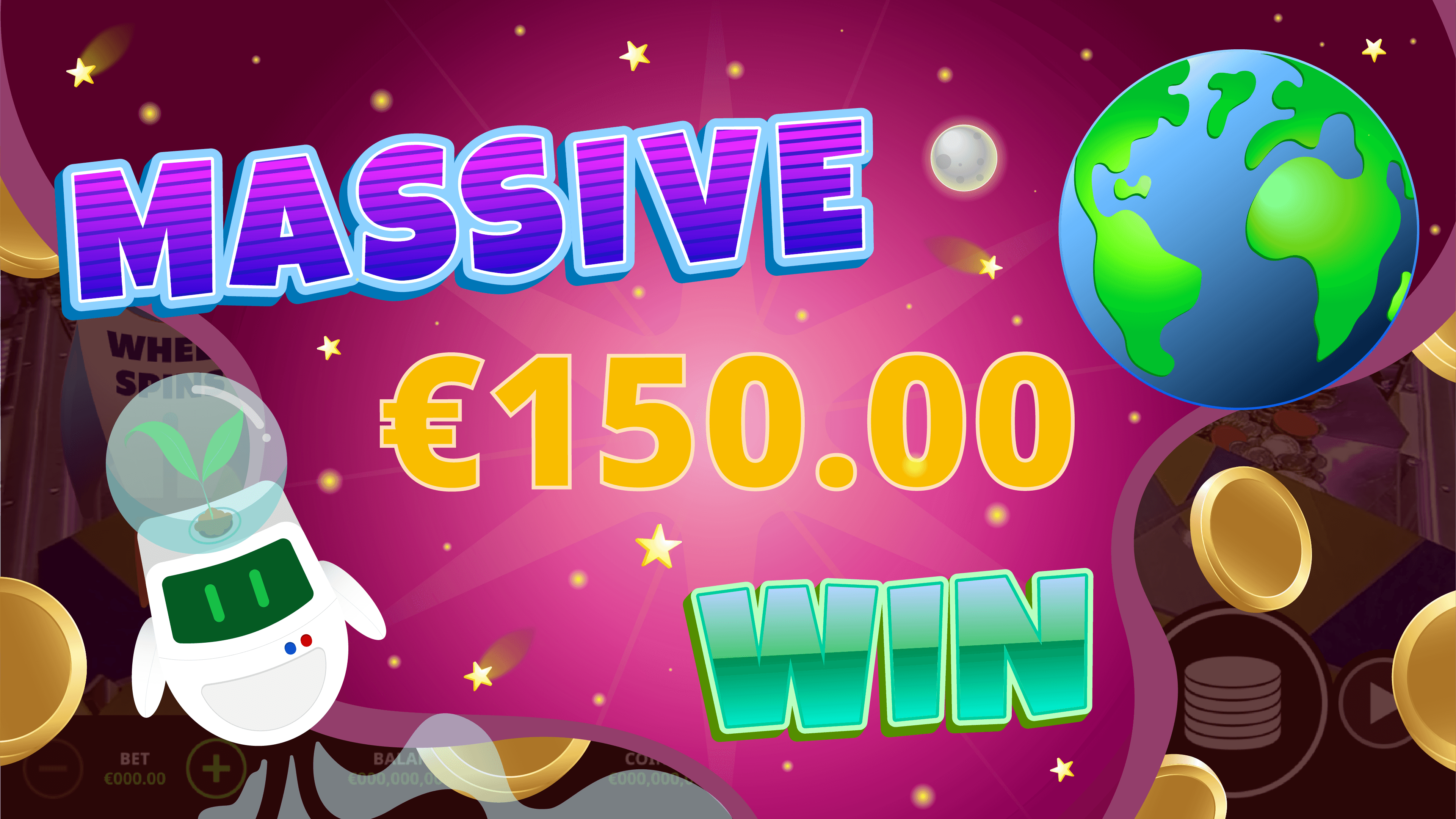
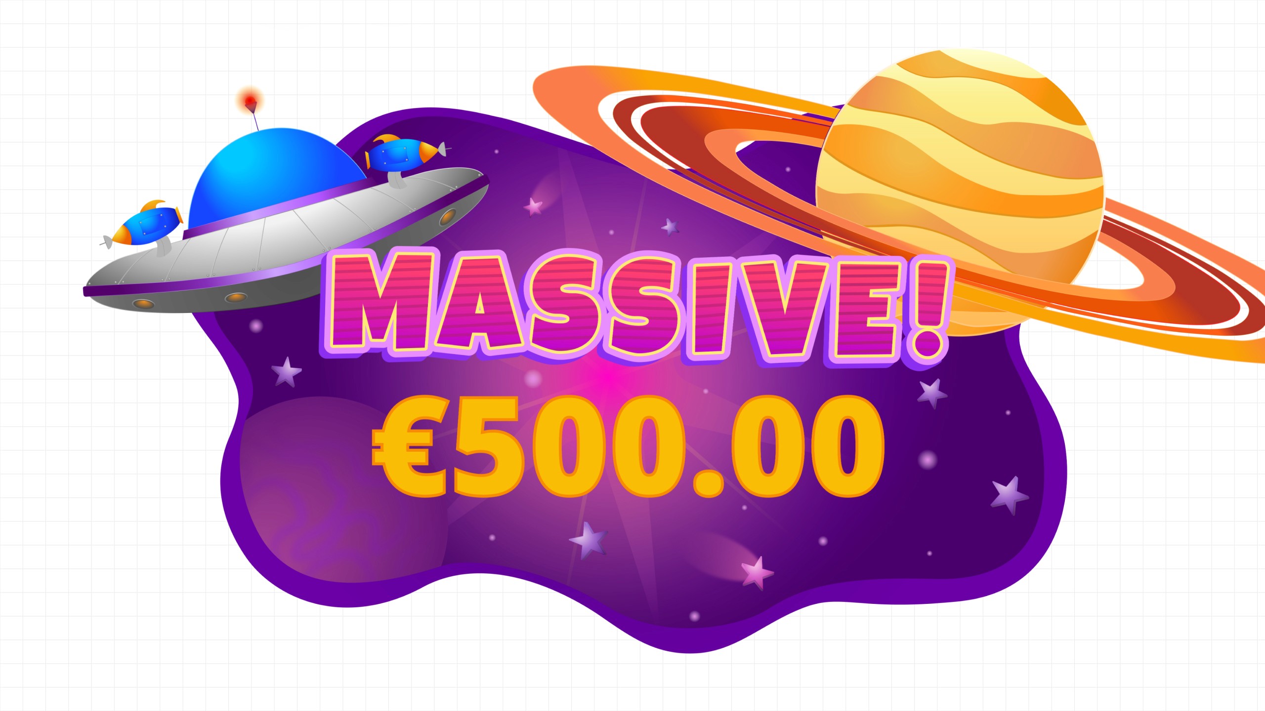
large win → "Massive!"
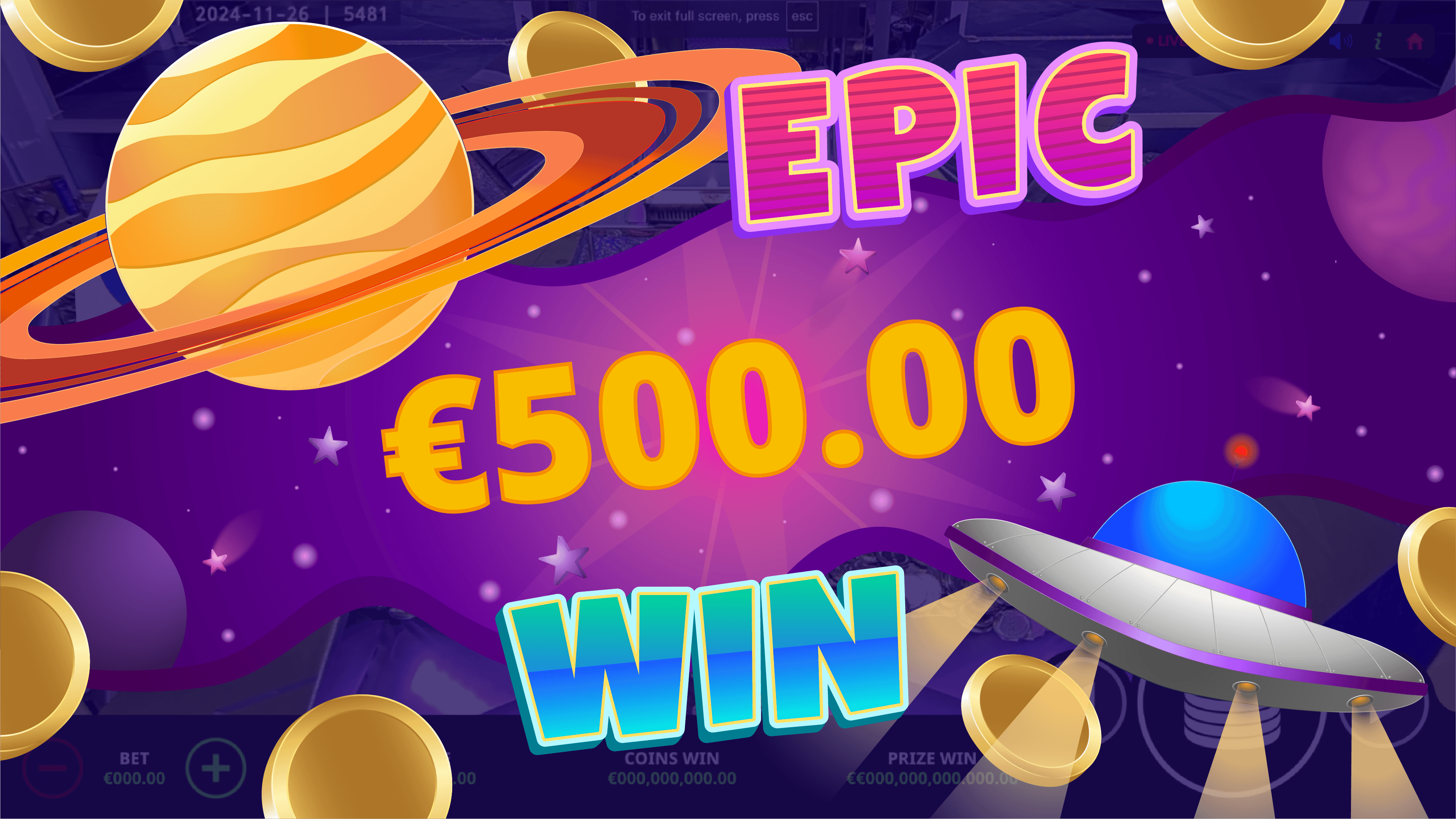
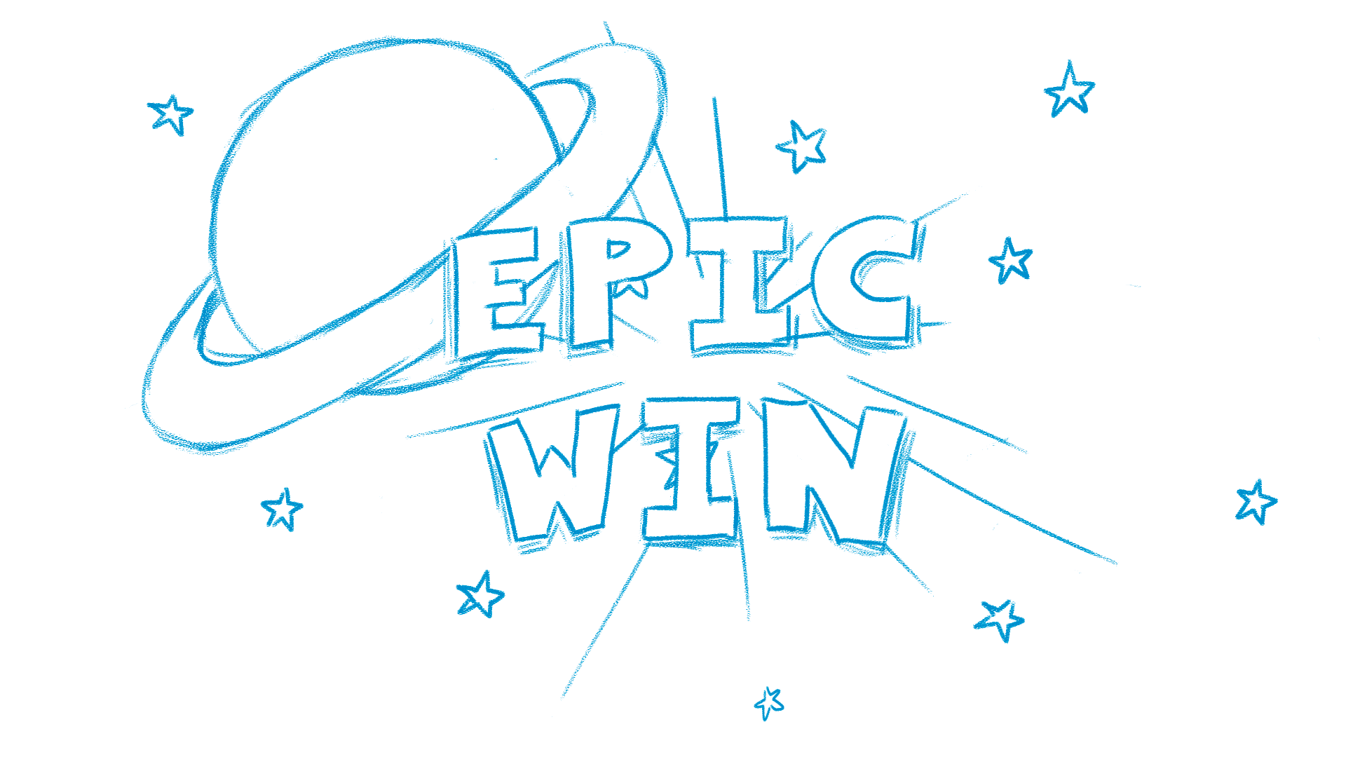
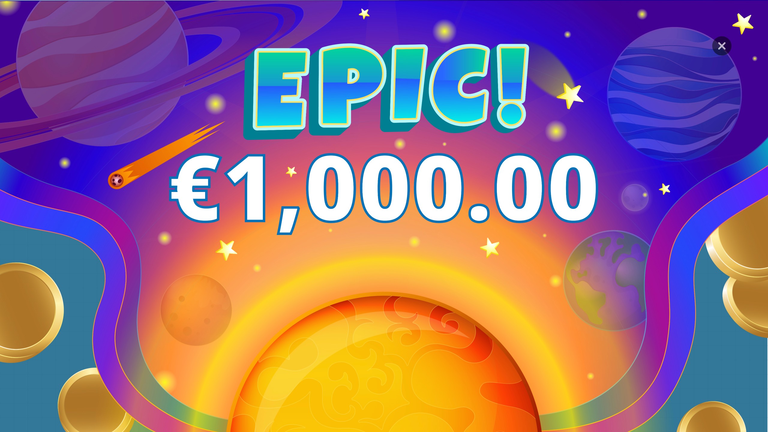
extra large win /Jackpot → "Epic!"
Choosing the animation architecture
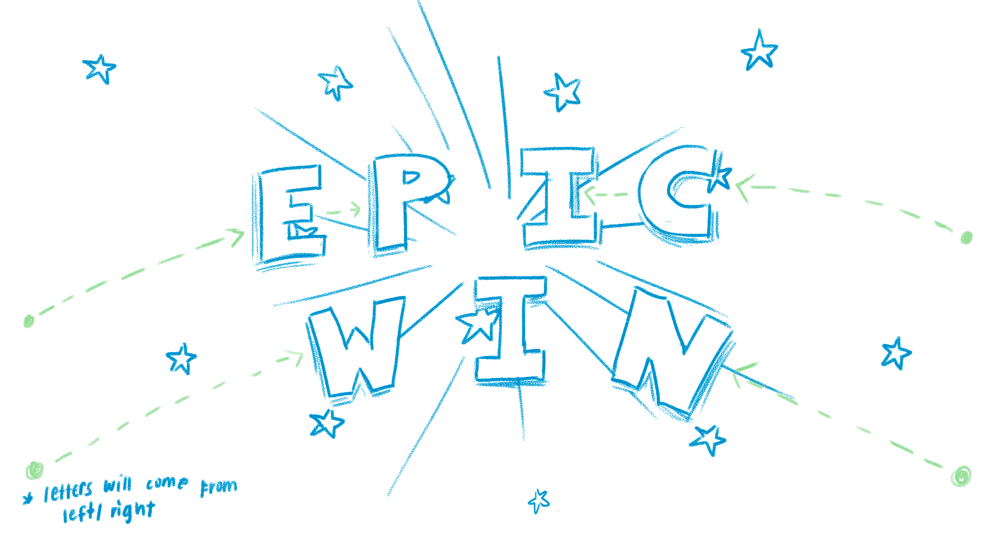
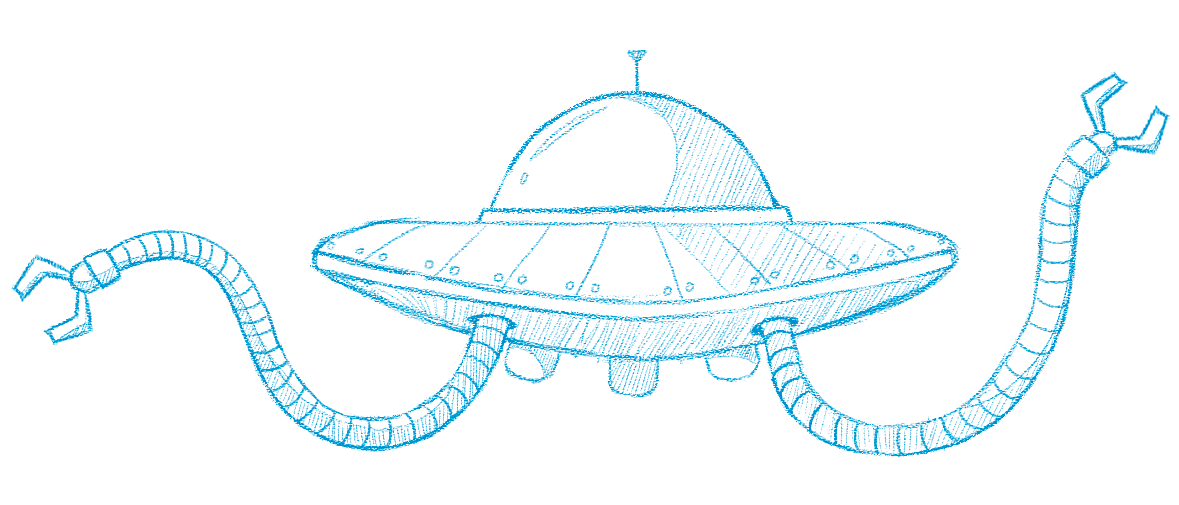
Initial storyboard sketches
Previous projects relied on PNG-based animations, which resulted in large asset sizes and inconsistent playback on lower-end devices.
To avoid these issues, I proposed building the system using Rive, which supports vector animations controlled through state machines. This approach allowed us to:
*
Significantly reduce asset size
*
Maintain smooth playback across devices and
*
Give developers precise control over animation timing and triggers
Sound as part of the feedback system
To reinforce the hierarchy, I also curated audio cues for each feedback tier.
Rather than treating sound as decorative, the goal was to strengthen the feedback signal. Lower-tier wins use short and lightweight effects, while higher tiers introduce layered sounds and celebratory music.
This progression allows players to recognize reward magnitude through both visual and audio cues, strengthening the overall feedback loop.
XS wins have short, punchy sound effects that are powerful but subtle enough not to interrupt gameplay
S wins are slightly longer and brighter effects that break the rhythm and signal a noticeable reward.
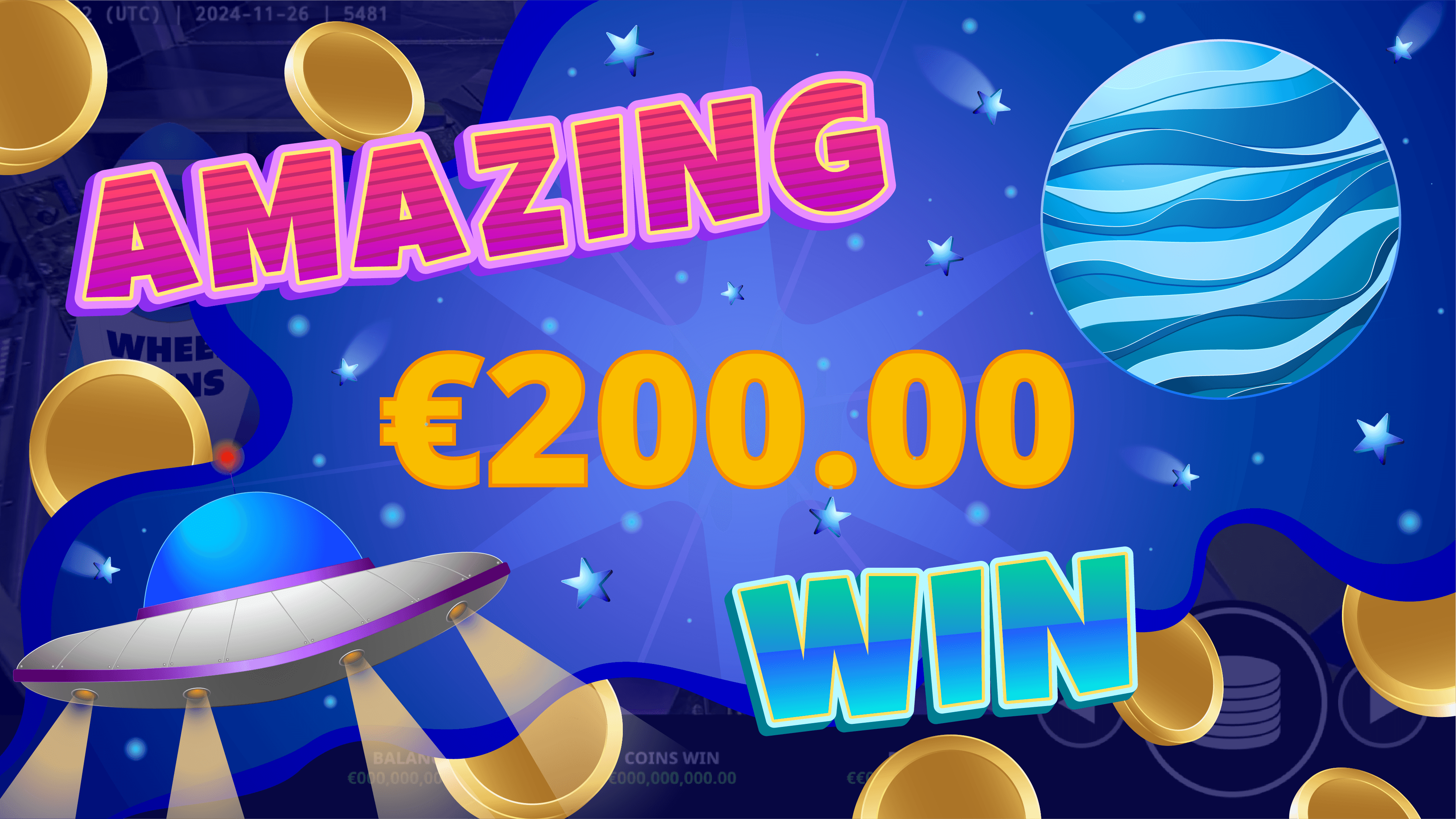
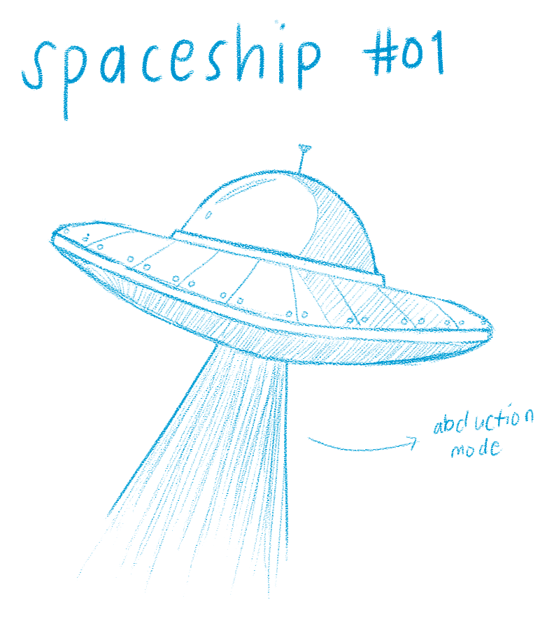
M wins included a subtle hovering spaceship sound to complement the spaceship illustration in the animation.
L wins have layered laser effects to match the spaceship firing animation, adding intensity.
and lastly, for XL wins/Jackpots I introduced looping, celebratory background music with layered sound effects for maximum impact.
DESIGN DIRECTION
Making system states visible
From the outset, the win system was meant to feel colorful and loud, not in a chaotic way, but in a way that clearly signals celebration.
While space themes often lean into dark, minimal palettes, I intentionally avoided muted or overly realistic interpretations.
My goal was not atmospheric immersion, but emotional amplification.
I used bright, saturated elements layered over deep (but not fully black) backgrounds to create strong contrast without compromising readability.
This allowed the animations to feel energetic while still remaining legible during fast-paced gameplay.
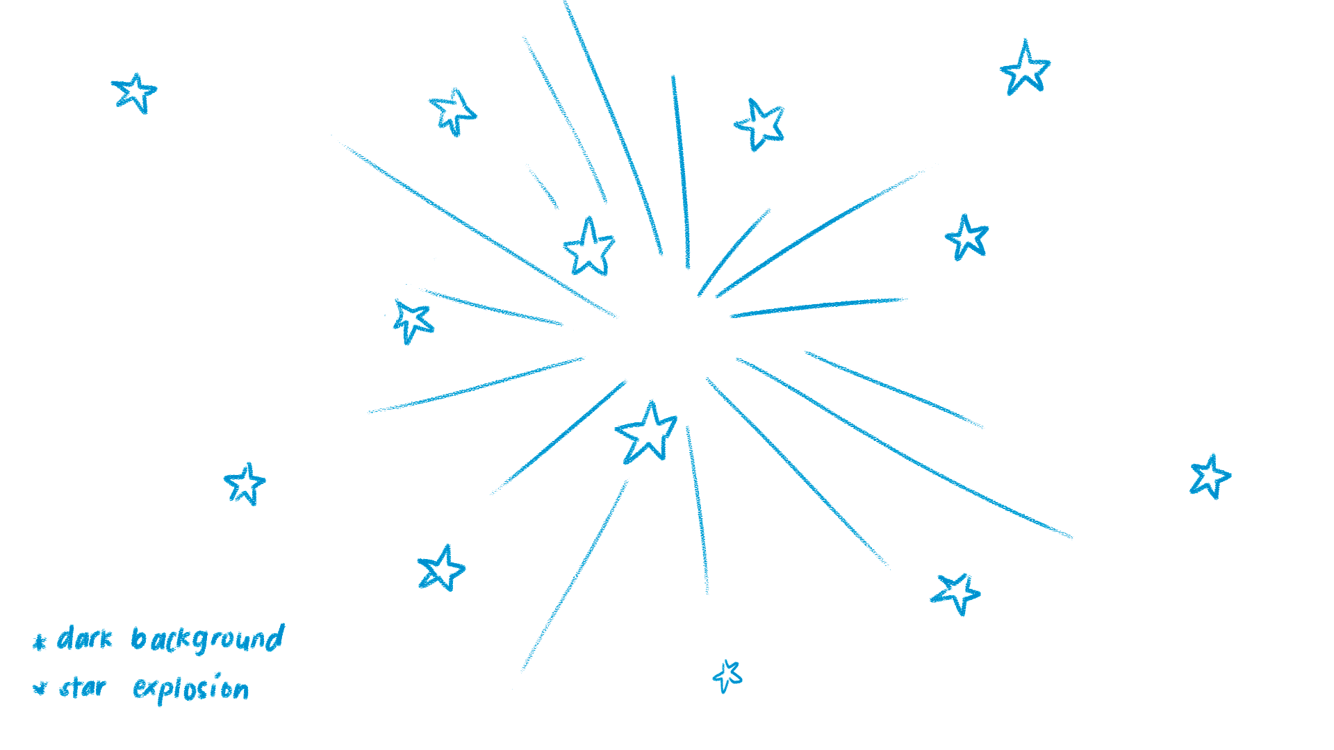
Early sketches helped explore composition, scale, and motion emphasis before moving into high-fidelity illustrations.
Hierarchy was expressed through scale and motion rather than text alone.
Lower tiers remain compact and subtle so gameplay can continue smoothly, while mid-tier wins introduce stronger visual presence. At the highest tier, jackpot moments expand dramatically to dominate the screen.

This progression ensures players can instantly sense the magnitude of a win, even without reading the amount.
Color, motion, and proportion work together as a unified system, reinforcing hierarchy through multiple channels rather than relying on a single cue.
IMPLEMENTATION
From system logic to interface behavior
The animations were implemented in Rive, using state machine logic to control transitions between feedback states.
Each win tier corresponds to a specific animation state triggered by gameplay events.
This structure allowed developers to map platform events directly to interface responses while maintaining a lightweight and reusable system.
FINAL OUTCOME
What we shipped
The final result is a scalable real-time feedback system that translates gameplay events into clear and differentiated player experiences.
The system:
Communicates reward hierarchy through scale, motion, and sound
Maintains smooth performance across devices
Uses reusable animation states controlled by event triggers
Establishes a framework that can be extended to other reward mechanics
The redesigned system ensures that high-value wins feel impactful while remaining technically efficient.
Extra small win animation
Small win animation
Medium win animation
Large win animation
Extra large win/Jackpot animation
WHAT I'D IMPROVE NEXT
If we had more time..
I would propose to further validate animation performance across a broader range of devices to ensure consistency, particularly on lower-end hardware.
I would also explore adding haptic feedback on mobile to create an additional layer of sensory differentiation between tiers.
Finally, I’d look at extending the system beyond win moments, applying the same scalable framework to bonus rounds and other reward mechanics to strengthen cohesion across the game experience.
REFLECTION
What I learned
This project reinforced the importance of designing systems, not just moments, and of balancing ambition with practical constraints. By iterating closely with product and development, we were able to ship a solution that feels expressive, scalable, and grounded in real-world limitations.
